Marketers
A shared team for strategy, copy, design and campaigns, every month.
Website developmentCapability pages, useful proof and a direct path to an enquiry.
BrandingPositioning, identity and sales material that explain why you're worth choosing.
SEO and AI searchGet found on Google and in AI answers by the people who buy what you make.
Performance marketingGoogle, LinkedIn and Meta ads measured on qualified enquiries.
AI automation & CRMEvery enquiry gets an owner and a next step, with human review.
 Two minutes, no email neededFind the one thing to fix firstTake the quiz→
When a Product Selector Helps More Than Another Landing Page
Decide whether a product selector or quiz will help buyers, then plan approved rules, useful results, uncertain answers and ongoing maintenance.
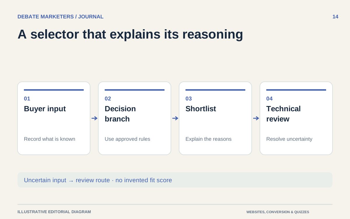
Another landing page will not resolve a product choice if the buyer still has to interpret a complicated catalog alone. Sometimes the missing tool is a selector: a short sequence of questions that narrows options and explains a sensible next step.
But an interactive quiz is not inherently more useful than a well-written page. It needs a decision that can be expressed responsibly, product data that can be maintained and a result worth the buyer's effort.
Before commissioning one, work through the decision it is supposed to support.
Look for a repeatable selection problem
A selector is worth considering when buyers face several legitimate options and a small set of known factors changes which options deserve attention.
Ask sales to describe a common first conversation. Which questions are asked in a consistent order? Which answers remove clearly unsuitable categories? Which answers require an expert to stop and investigate?
If the conversation mostly explains one product's value, improve the product or landing page first. If it depends on many exceptions that cannot be captured reliably, offer a guided consultation rather than a falsely confident result.
A selector should reduce a defined uncertainty. “Make the website more interactive” is too vague a brief.
Write the result before writing the questions
Decide what the buyer will receive. It might be a shortlist of product families, an explanation of the differences, a requirements summary or a recommendation to request technical review.
An illustrative selector for a fictional enclosure supplier could return two enclosure families to investigate, the inputs that led to those options and a list of unanswered requirements. It should not declare that either product is certified or suitable for an application unless the approved rules and evidence support that conclusion.
Include links to the relevant product information and let the buyer revisit their answers. If the result cannot explain why it exists, the underlying logic probably needs more work.
Avoid requiring contact details merely to reveal an elementary result. A useful optional next step is to send the reviewed requirement summary with an inquiry.
Use approved rules, including the exceptions
Create a plain-language decision table before designing screens. For each question, record the available answers, what they change and who approved the rule.
Separate a commercial preference from a technical restriction. A preferred lead time should not silently overrule an incompatibility. A missing answer should not be treated as if the buyer selected a safe default.
Provide routes for “not sure,” “none of these” and conflicting requirements. Sometimes the correct output is that the selector cannot narrow the choice without more information.
For safety-critical or regulated applications, keep the scope especially narrow and have qualified specialists define the review boundary. A website tool should not present a preliminary shortlist as engineering approval.
Ask questions buyers can answer
Use familiar terms and explain specialist ones at the point of need. If the buyer needs a measurement, show where to find it and require the relevant unit. Do not ask for a calculation that your intended user cannot reasonably perform.
Order questions so that broad distinctions come before detailed inputs. Show conditional questions only when they apply, and keep a visible summary as the selection develops.
A progress indicator should reflect the actual flow. If answers change the remaining steps, avoid a fixed promise that becomes inaccurate halfway through.
Give the buyer a way to move backward without losing previous work. Test what happens when a changed answer invalidates an earlier result; outdated recommendations should not remain on screen as if they were current.
Make the interaction work beyond a mouse
A selector's core actions should be operable with a keyboard, consistent with W3C's keyboard accessibility guidance. W3C keyboard guidance
Use descriptive labels for inputs and make their relationship clear to assistive technology. W3C labeling guidance
Test the entire journey with a keyboard, on a small screen and with relevant assistive technology. Check question changes, errors, results and the return path. A set of clickable cards can look simple while leaving part of the audience unable to complete the task.
Budget for maintenance before launch
Give the product data and decision rules named owners. A discontinued option, changed specification or revised application boundary must reach the selector as well as the catalog.
Maintain representative test cases: straightforward matches, boundary conditions, conflicting inputs and no suitable result. Run them after rule or data changes. Keep a version record so an inquiry can be interpreted against the logic that produced it.
Evaluate usefulness through completion, appropriate next steps and sales feedback on the requirement summaries. More quiz starts alone do not establish better product selection or better opportunities.
Start with one narrow, valuable decision. Discuss it with Debate Marketers if you need a shared, multidisciplinary managed team to connect the content, interface and implementation.
We plan and run admissions campaigns, websites, SEO and AI search, ads and CRM follow-up for schools, manufacturers and growing brands, from teams in New Delhi and Malta.
Published 3 October 2026.
More articles

How to Find Buyers for Export: Marketing and Branding That Win Orders
How import and export companies find buyers in 2026: buyer finder tools, trade data, B2B portals, LinkedIn and AI search, and the branding that wins orders.

AEO and GEO Best Practices for 2026: A Guide for B2B and Retail
What Google, Microsoft and OpenAI say about AEO and GEO, what studies show gets cited, and best practices for B2B pages, product feeds and measurement in 2026.

How to Choose an SEO Agency in 2026: A B2B and Retail Checklist
What to ask an SEO agency, how to score proposals, what AEO and GEO work should cover, what SEO costs in 2026 and the contract terms to agree before signing.
When a Product Selector Helps More Than Another Landing Page
Decide whether a product selector or quiz will help buyers, then plan approved rules, useful results, uncertain answers and ongoing maintenance.
Another landing page will not resolve a product choice if the buyer still has to interpret a complicated catalog alone. Sometimes the missing tool is a selector: a short sequence of questions that narrows options and explains a sensible next step.
But an interactive quiz is not inherently more useful than a well-written page. It needs a decision that can be expressed responsibly, product data that can be maintained and a result worth the buyer's effort.
Before commissioning one, work through the decision it is supposed to support.
Look for a repeatable selection problem
A selector is worth considering when buyers face several legitimate options and a small set of known factors changes which options deserve attention.
Ask sales to describe a common first conversation. Which questions are asked in a consistent order? Which answers remove clearly unsuitable categories? Which answers require an expert to stop and investigate?
If the conversation mostly explains one product's value, improve the product or landing page first. If it depends on many exceptions that cannot be captured reliably, offer a guided consultation rather than a falsely confident result.
A selector should reduce a defined uncertainty. “Make the website more interactive” is too vague a brief.
Write the result before writing the questions
Decide what the buyer will receive. It might be a shortlist of product families, an explanation of the differences, a requirements summary or a recommendation to request technical review.
An illustrative selector for a fictional enclosure supplier could return two enclosure families to investigate, the inputs that led to those options and a list of unanswered requirements. It should not declare that either product is certified or suitable for an application unless the approved rules and evidence support that conclusion.
Include links to the relevant product information and let the buyer revisit their answers. If the result cannot explain why it exists, the underlying logic probably needs more work.
Avoid requiring contact details merely to reveal an elementary result. A useful optional next step is to send the reviewed requirement summary with an inquiry.
Use approved rules, including the exceptions
Create a plain-language decision table before designing screens. For each question, record the available answers, what they change and who approved the rule.
Separate a commercial preference from a technical restriction. A preferred lead time should not silently overrule an incompatibility. A missing answer should not be treated as if the buyer selected a safe default.
Provide routes for “not sure,” “none of these” and conflicting requirements. Sometimes the correct output is that the selector cannot narrow the choice without more information.
For safety-critical or regulated applications, keep the scope especially narrow and have qualified specialists define the review boundary. A website tool should not present a preliminary shortlist as engineering approval.
Ask questions buyers can answer
Use familiar terms and explain specialist ones at the point of need. If the buyer needs a measurement, show where to find it and require the relevant unit. Do not ask for a calculation that your intended user cannot reasonably perform.
Order questions so that broad distinctions come before detailed inputs. Show conditional questions only when they apply, and keep a visible summary as the selection develops.
A progress indicator should reflect the actual flow. If answers change the remaining steps, avoid a fixed promise that becomes inaccurate halfway through.
Give the buyer a way to move backward without losing previous work. Test what happens when a changed answer invalidates an earlier result; outdated recommendations should not remain on screen as if they were current.
Make the interaction work beyond a mouse
A selector's core actions should be operable with a keyboard, consistent with W3C's keyboard accessibility guidance. W3C keyboard guidance
Use descriptive labels for inputs and make their relationship clear to assistive technology. W3C labeling guidance
Test the entire journey with a keyboard, on a small screen and with relevant assistive technology. Check question changes, errors, results and the return path. A set of clickable cards can look simple while leaving part of the audience unable to complete the task.
Budget for maintenance before launch
Give the product data and decision rules named owners. A discontinued option, changed specification or revised application boundary must reach the selector as well as the catalog.
Maintain representative test cases: straightforward matches, boundary conditions, conflicting inputs and no suitable result. Run them after rule or data changes. Keep a version record so an inquiry can be interpreted against the logic that produced it.
Evaluate usefulness through completion, appropriate next steps and sales feedback on the requirement summaries. More quiz starts alone do not establish better product selection or better opportunities.
Start with one narrow, valuable decision. Discuss it with Debate Marketers if you need a shared, multidisciplinary managed team to connect the content, interface and implementation.
We plan and run admissions campaigns, websites, SEO and AI search, ads and CRM follow-up for schools, manufacturers and growing brands, from teams in New Delhi and Malta.
Published 3 October 2026.
More articles
How to Find Buyers for Export: Marketing and Branding That Win Orders
How import and export companies find buyers in 2026: buyer finder tools, trade data, B2B portals, LinkedIn and AI search, and the branding that wins orders.
AEO and GEO Best Practices for 2026: A Guide for B2B and Retail
What Google, Microsoft and OpenAI say about AEO and GEO, what studies show gets cited, and best practices for B2B pages, product feeds and measurement in 2026.
How to Choose an SEO Agency in 2026: A B2B and Retail Checklist
What to ask an SEO agency, how to score proposals, what AEO and GEO work should cover, what SEO costs in 2026 and the contract terms to agree before signing.
When a Product Selector Helps More Than Another Landing Page
Decide whether a product selector or quiz will help buyers, then plan approved rules, useful results, uncertain answers and ongoing maintenance.
Another landing page will not resolve a product choice if the buyer still has to interpret a complicated catalog alone. Sometimes the missing tool is a selector: a short sequence of questions that narrows options and explains a sensible next step.
But an interactive quiz is not inherently more useful than a well-written page. It needs a decision that can be expressed responsibly, product data that can be maintained and a result worth the buyer's effort.
Before commissioning one, work through the decision it is supposed to support.
Look for a repeatable selection problem
A selector is worth considering when buyers face several legitimate options and a small set of known factors changes which options deserve attention.
Ask sales to describe a common first conversation. Which questions are asked in a consistent order? Which answers remove clearly unsuitable categories? Which answers require an expert to stop and investigate?
If the conversation mostly explains one product's value, improve the product or landing page first. If it depends on many exceptions that cannot be captured reliably, offer a guided consultation rather than a falsely confident result.
A selector should reduce a defined uncertainty. “Make the website more interactive” is too vague a brief.
Write the result before writing the questions
Decide what the buyer will receive. It might be a shortlist of product families, an explanation of the differences, a requirements summary or a recommendation to request technical review.
An illustrative selector for a fictional enclosure supplier could return two enclosure families to investigate, the inputs that led to those options and a list of unanswered requirements. It should not declare that either product is certified or suitable for an application unless the approved rules and evidence support that conclusion.
Include links to the relevant product information and let the buyer revisit their answers. If the result cannot explain why it exists, the underlying logic probably needs more work.
Avoid requiring contact details merely to reveal an elementary result. A useful optional next step is to send the reviewed requirement summary with an inquiry.
Use approved rules, including the exceptions
Create a plain-language decision table before designing screens. For each question, record the available answers, what they change and who approved the rule.
Separate a commercial preference from a technical restriction. A preferred lead time should not silently overrule an incompatibility. A missing answer should not be treated as if the buyer selected a safe default.
Provide routes for “not sure,” “none of these” and conflicting requirements. Sometimes the correct output is that the selector cannot narrow the choice without more information.
For safety-critical or regulated applications, keep the scope especially narrow and have qualified specialists define the review boundary. A website tool should not present a preliminary shortlist as engineering approval.
Ask questions buyers can answer
Use familiar terms and explain specialist ones at the point of need. If the buyer needs a measurement, show where to find it and require the relevant unit. Do not ask for a calculation that your intended user cannot reasonably perform.
Order questions so that broad distinctions come before detailed inputs. Show conditional questions only when they apply, and keep a visible summary as the selection develops.
A progress indicator should reflect the actual flow. If answers change the remaining steps, avoid a fixed promise that becomes inaccurate halfway through.
Give the buyer a way to move backward without losing previous work. Test what happens when a changed answer invalidates an earlier result; outdated recommendations should not remain on screen as if they were current.
Make the interaction work beyond a mouse
A selector's core actions should be operable with a keyboard, consistent with W3C's keyboard accessibility guidance. W3C keyboard guidance
Use descriptive labels for inputs and make their relationship clear to assistive technology. W3C labeling guidance
Test the entire journey with a keyboard, on a small screen and with relevant assistive technology. Check question changes, errors, results and the return path. A set of clickable cards can look simple while leaving part of the audience unable to complete the task.
Budget for maintenance before launch
Give the product data and decision rules named owners. A discontinued option, changed specification or revised application boundary must reach the selector as well as the catalog.
Maintain representative test cases: straightforward matches, boundary conditions, conflicting inputs and no suitable result. Run them after rule or data changes. Keep a version record so an inquiry can be interpreted against the logic that produced it.
Evaluate usefulness through completion, appropriate next steps and sales feedback on the requirement summaries. More quiz starts alone do not establish better product selection or better opportunities.
Start with one narrow, valuable decision. Discuss it with Debate Marketers if you need a shared, multidisciplinary managed team to connect the content, interface and implementation.
We plan and run admissions campaigns, websites, SEO and AI search, ads and CRM follow-up for schools, manufacturers and growing brands, from teams in New Delhi and Malta.
Published 3 October 2026.
More articles
How to Find Buyers for Export: Marketing and Branding That Win Orders
How import and export companies find buyers in 2026: buyer finder tools, trade data, B2B portals, LinkedIn and AI search, and the branding that wins orders.
AEO and GEO Best Practices for 2026: A Guide for B2B and Retail
What Google, Microsoft and OpenAI say about AEO and GEO, what studies show gets cited, and best practices for B2B pages, product feeds and measurement in 2026.
How to Choose an SEO Agency in 2026: A B2B and Retail Checklist
What to ask an SEO agency, how to score proposals, what AEO and GEO work should cover, what SEO costs in 2026 and the contract terms to agree before signing.
Bring your first priority.
Bring one problem: a brand that's drifted, a website that doesn't sell or enquiries going nowhere. We'll spend 30 minutes finding the first fix.
Projects & shared-team retainers
Bring your first priority.
Bring one problem: a brand that's drifted, a website that doesn't sell or enquiries going nowhere. We'll spend 30 minutes finding the first fix.
Projects & shared-team retainers